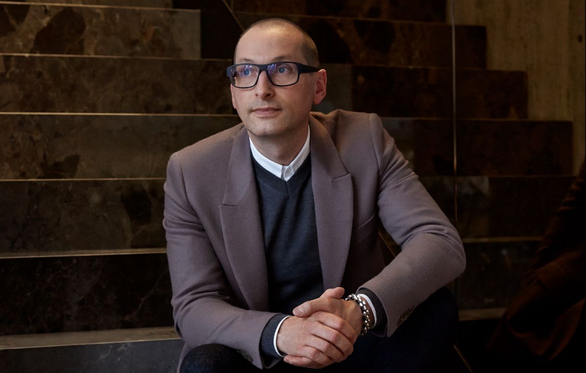
As Creative Director of Hieronymus, Thorsten Traber has developed the entire look and feel of the brand and is the mastermind behind its entire product range – from product design to brand strategy, graphic design, interior design, and packaging design. Here he explains the inspiration and the thinking behind the timeless and timely elegance of the company and its products.
A Vocabulary of Restraint
Inside
You have played an incredibly wide-reaching role in creating the look and feel of Hieronymus and its products. How would you sum up what you have achieved aesthetically with the brand?
Through the interplay of choice materials, simple contemporary design and subtly balanced colours, we have created a range of products that please the senses. Our vocabulary combines purist, classic and eclectic attributes that emanate an inherent sense of calm. If you look closer, you will find precise attention to detail and surprising haptic experiences. A coherent and harmonious gesamtkonzept rules the entire collection, one that can be freshly interpreted again and again. We take care to reinterpret our design language with each new product so that we are continually giving our brand and our range new impulses.
How does Hieronymus distinguish itself from other high-end stationery firms?
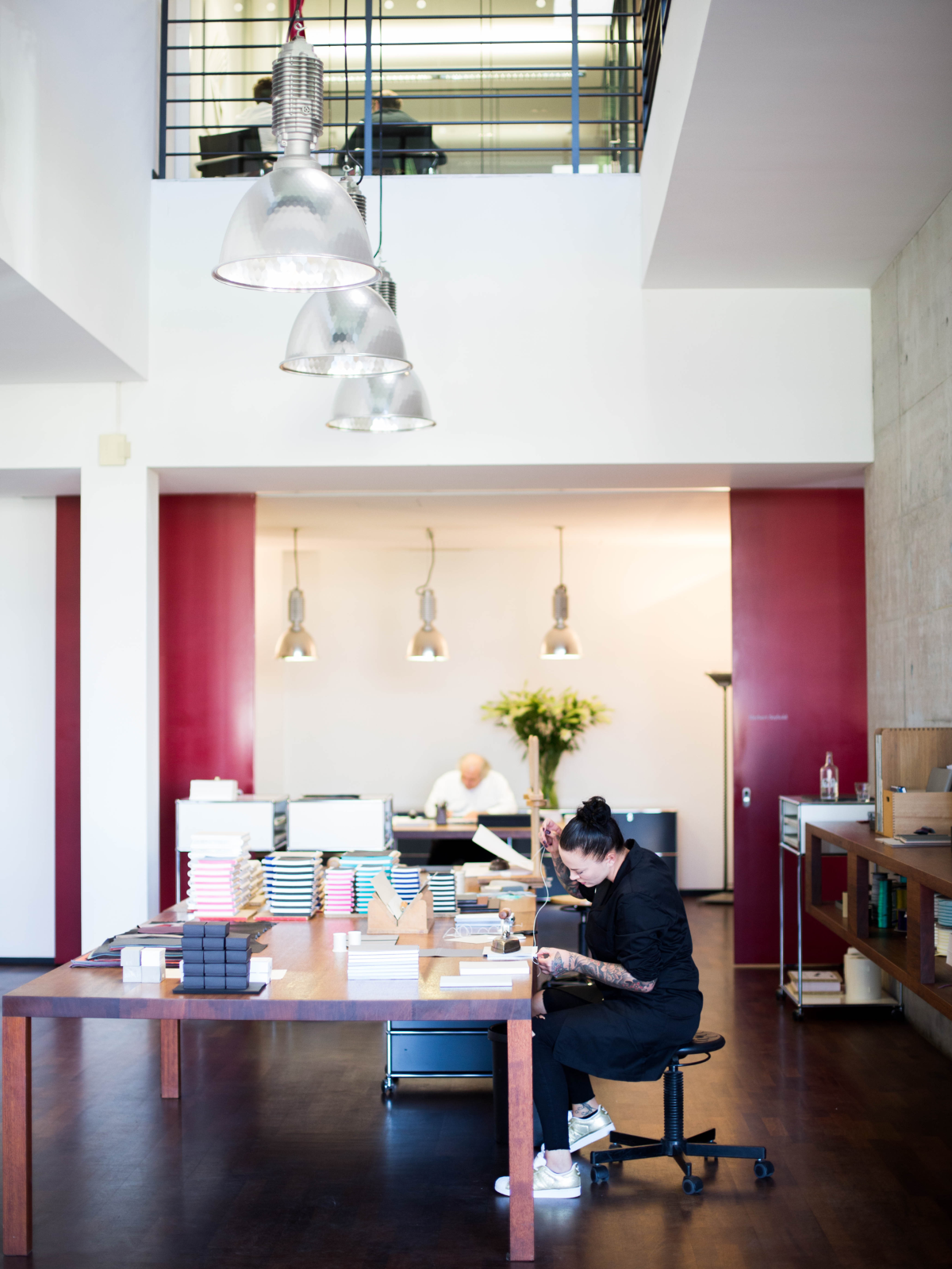
The main difference is that we don’t see ourselves just as a stationery firm. Hieronymus is about the high culture of paper and writing. We create products from stationery through to writing furniture and utensils to furnish Private Studies.
Hieronymus has an extensive vocabulary of design elements, which are implemented according to the respective requirements and touch-points of each product. So, for each range we carefully compose and put together haptic, visual and other sensory experiences (such as scent). Thanks to this design approach, we have been able to reinterpret the traditional theme of paper and writing culture for contemporary aesthetes and also inspire a younger audience.
The ideology behind Hieronymus is very much about taking the time to pay attention to certain special and important things in life. How do you reflect that approach in colours, shapes and materials?
The branding on the products is restrained; it does not push itself into the limelight but sees itself as a stage for the expression of the personal desires of users of its products. You won’t find any big status-oriented logos. Our products are notable for their unobtrusive simplicity, which elegantly underlines the personalities of their owners. All the brand elements and their implementation follow these maxims.
Also the colour palette and formal language is calm and restrained, which means it can integrate comfortably into any living environment. The brand’s base colours are black, white (the soft white tone of cotton paper) and the silver edge. The entire collection follows the same colour principles. We use strictly muted, discreet colours in deliberately nuanced shades. Bright colours are intentionally used sparingly to create fine accents.
Why make paper and writing products at precisely the moment when the world is supposedly becoming paperless?
The digital age works very much to Hieronymus’ advantage. The paper-free revolution has meant that personal stationery has become a new status symbol, one that is very much appreciated - and by younger generations as well. Thanks to our high-speed life, handwritten words have become rare and therefore more exclusive and emotionally valuable. A handwritten card is nowadays a sign of true personal appreciation.
How big a role does storytelling play at Hieronymus?
The products themselves do not tell stories, but we do see our world and our collection as a platform upon which to tell stories. Stories, ideas and visions, whether in literature, art, architecture, fashion or design, begin on paper – even in the digital age. It is not just the selection of materials that inspires, paper is, as it always has been, predestined to capture stories and ideas. It helps with thinking, with remembering and with concentration.
That said, there are some brand elements that are connected to myths and stories. Our logo is a serpent dragon eating its own tail, circled around the Hieronymus “H”. Ouroboros, as it is called, is an ancient symbol representing the eternal circle of life and death and of nature continually renewing itself. The dragon serpent biting its own tail represents its own closed universe, protecting its treasure within.
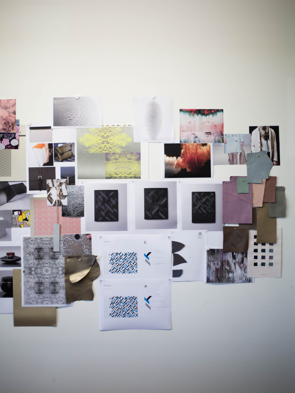
You have also been responsible for many of the patterns on Hieronymus products, haven’t you? How do you approach sourcing patterns for the collections?
Yes of course, everyday life is full of inspiration for me – and it often comes quite spontaneously and unexpectedly. Perhaps a particular situation on the street, from art, architecture, different cultures, literature, films, exchanges with friends, or interesting encounters; an exhibition about Japanese fashion, for example, a piece of historical Venetian brocade, or the art of Gerhard Richter.
We have a particular pattern, the Tamangur, which is based on an aerial photograph of an ancient stone pine forest in the Lower Engadine region of the Alps. A discussion about the lovely smell of the pine wood from the Tamangur forest there, called Arvenholz, fuelled a desire to find out more about this remote moor and pine landscape. The dense forest there is unique. It is the highest complete stone pine forest in Europe and legend says that as long as this forest survives, so too will the Romansch language. The story fascinated us so much that we incorporated it into the Hieronymus world in the form of a special print and embossing pattern. The pattern is based on a digitally manipulated aerial photograph of the forest and looks, despite its geometrical precision, extremely natural.
Hieronymus has launched the first issue of its magazine, the Hieronymus Journal, for which you also did the graphic design. What kind of special paper treatments and printing techniques did you employ for this new publication?
The Hieronymus Journal is not just another corporate magazine. It’s a collector’s item, a miscellany consisting of specially commissioned interviews and original texts. It contains no advertisements and is strictly limited to a certain amount of copies. Consequently, the haptic experience also had to be one of a kind and we wanted to print-finish the magazine to the highest standards. We were using a combination of offset printing, silk-screen printing and several layer hot foil stamping. The paper for the cover is exclusive Japanese paper and for the endpapers we used slightly perforated paper, also from Japan.
Where would you like to go next with the Hieronymus brand?
We will continue to build our Hieronymus cosmos. We are constantly developing new products to enrich the paper and writing culture, refining our bespoke services, fuelling the brand with new stories and eventually we aim to open flagship stores on international ground.