Artworks for Amplification
Art & Design
The internationally renowned illustrator Gregory Gilbert-Lodge counts the V&A, Dazed & Confused and the Swiss government amongst his customers. He is also the illustrator of the Ouroboros trademark and has provided illustrations for the first issue of the Hieronymus Journal as well as for several greeting card collections. Mindspace talked to him about inspiration, imagination and his workspace.
So where did life start for Gregory Gilbert-Lodge? And how did it bring you to illustration?
As a Swiss-British citizen I grew up close to Cologne in Germany on the wonderful river Rhein in a small place called Boppard. I came back to Switzerland at the age of 18 to study graphic design first in Berne and then at the Art School in Biel-Bienne, where most of the teachers had a fine art background.
Whilst I was still studying I joined a group of artists called Silex. This became an important environment for me to develop my skills, perhaps not technically, in terms of how I design, but more in respect of how to approach a theme and interpret it in a unorthodox way, which was great fun. Silex has produced a number of publications over the years and is a winner of the Swiss Federal Design Award.
Not long after college I opened my own independent illustration studio, first in Biel-Bienne and then in Zurich. I have had jobs since in corporate design – for example the Openair Music-Festival Gurten Bern – and international commissions for newspaper and fashion magazines such as The Face, Dazed & Confused, Another Man and Zeit Magazin.
Can you remember your earliest inspiration to draw?
The first time I remember being interested in illustration was on a stay at my sister’s place in Paris where she lived at the time. After visiting a couple of gallery spaces and museums, it rained several days in a row and I was stuck in the apartment. From my own memory I started to draw what I had seen in the museums and also produced these painfully super-realistic pencil drawings from objects around me in the room as well as copying ads from magazines. My passion was born.
There does seem to be a “noir” comic theme to your work, who and what would you say were your influences?
It’s funny, maybe the noir comic theme does shine through my work in a sort of way. But I would rather describe my style as strongly influenced by painting. In my images I include the viewer’s imagination so many things are left out for them to fill in.
Nowadays I am much more inspired by contemporary artists like Steven Shearer and painters like Peter Doig, Raymond Pettibon or Wilhelm Sasnal. If you asked me for a big classic influence, then I guess it is Andy Warhol. He is someone I always come back to.
How do you find your mindspace for creating – how do you get in the “zone”? Do you have rituals?
I am constantly inspired by what I see around me and this provokes actions. Therefore, you could say my mindspace for creation is constantly ON. Creating an image in my style – this search for the self-evident and seemingly simple contour – is long and complex. It requires discipline, trust and determination, because I never know exactly how the image will look like until the end. Perhaps one ritual I do have is that I always try to sleep on a finished artwork for another night. Unfortunately, my clients don’t often give me the chance to do so.
Tell us a bit about your work process. Perhaps talk us through one project; you get a commission from a client, what happens next?
Here’s a good example: I was commissioned by the Cantonal Government & Administration Department of Zurich to design their official logo. It is the lion that every citizen of the canton of Zurich knows from the official letterhead. My job was to create a new, strong, visual trademark and brand from their heraldic symbol, which is the male lion I needed to unify the old lion logos for all 68 departments & authorities, each of which was different. The brief was to bring a vital and modern approach to the traditional symbol. I started the process by researching and generating ideas, but I still had to adhere to the narrow regulations and unspoken rules about how what the alleged heraldic lion symbol should look like. I presented repeated variations and iterations until, through discussion with my client, a design was selected for final refinement. Within a short time, the logo established itself in all cantonal departments as the official cooperate design. I created the logo in such a way that it can be applied in various dimensions from small give-aways to tax forms and voting slips to signalisation, flags and facades of buildings.
Both my logo designs as well as my more narrative illustrations often play with a formal codex, which is necessary to ensure their readability and make them iconic and stand out. The world of commercial and media-related images functions according to the rule of fast reading. To test these rules in a new kind of way and to make them accessible is a fascinating and major part of my artwork. A good example of this is the clown figure branding and poster art for the Swiss National Circus Knie that I designed in 2016. It is one in which all aspect of communication design came together, colour and humour played an important role too.
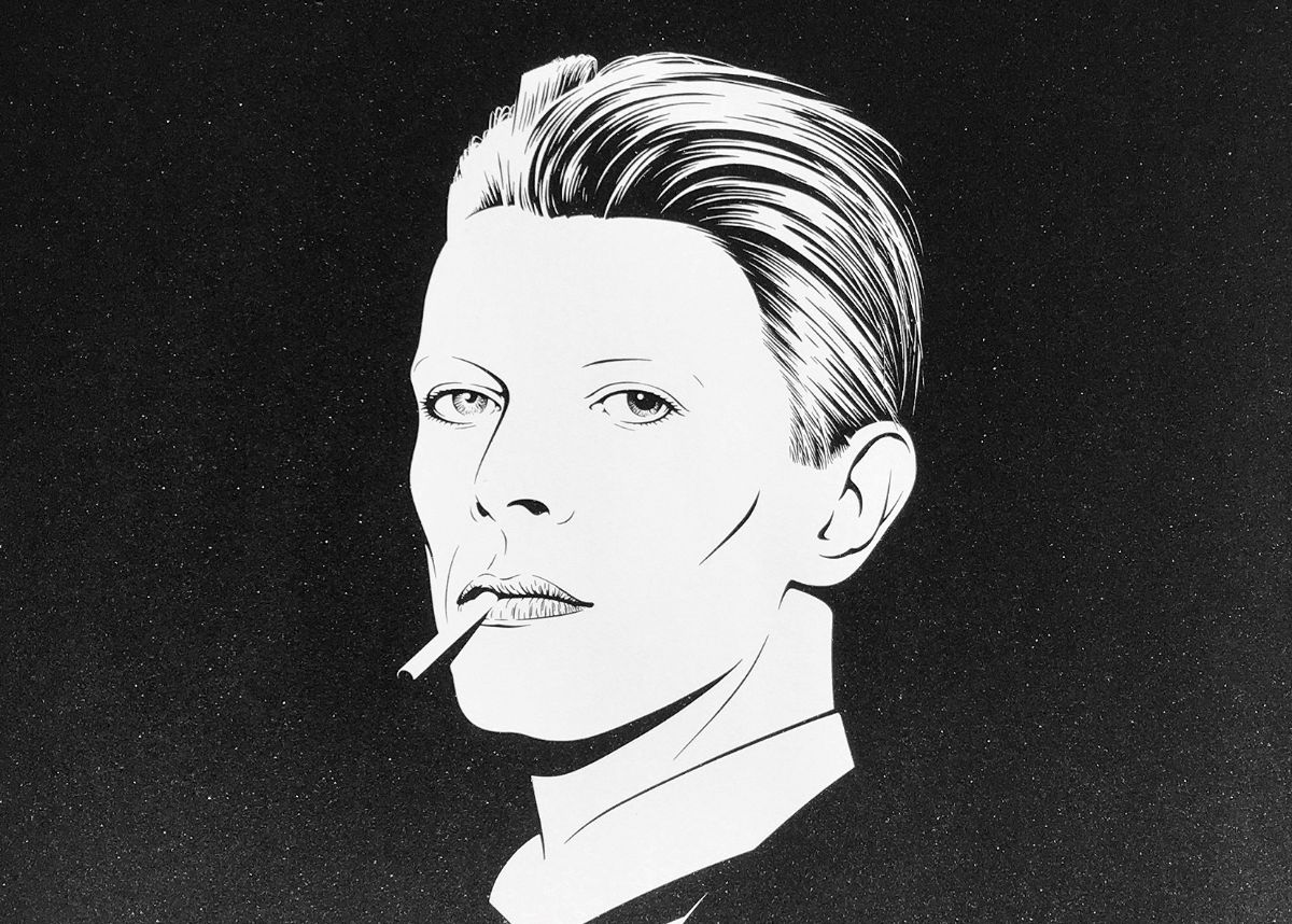
I try to bring a contemporary and very individual sensibility into the frame of each design. A frame that goes beyond the figurative content. This is as much the case with the Ouroboros design for Hieronymus Stationers as it is with portrait work for Vivienne Westwood or the David Bowie portrait commissioned by the V&A museum in London.
Do you work freely for yourself or only to commission?
As well as commissions, I produce one-off work and print editions that are sold worldwide. Reproduction plays a major role in my work. I think my artwork is meant to be amplified, whether by the mass-circulation of a magazine, by merchandising products like the ones I designed for Swiss International Air Lines or by a smaller edition of screen prints. Screen printing, for example, guarantees highly accurate borders and all-encompassing colours. I share this passion with Hieronymus. Moreover, it allows me to play with the surface: printing varnish and reflecting colours draw our attention, load the motive with subtle effects and point at the fact that what is shown is merely an image and surface. I just love it.
How do you combine digital and analogue within your work? What are your main tools?
In my workspace I have loads of books and magazines within close reach, that I still use often for research and inspiration. My main tool is a computer with a big digital drawing pad. I develop almost every commission digitally. My drawings are, for the most part, designed at and on the computer, it allows sampling and makes ideal contouring possible.
For my personal work I really love to come back to analogue tools like paint and brush, or produce woodcut edgings like my iconic image of Saint Sebastian, a limited edition woodcut print.
What do you do when you are not drawing?
Cycling. I go chase myself up the alps.
Please find here the Greeting Cards Gregory Gilbert-Lodge designed for Hieronymus.